If you’re involved in the housing market, and I assume that most of you are, you know very well that this is a numbers business. All of us are surrounded by housing-related data day in and day out, and it can become a little overwhelming at times — even for an economist like myself.
Well, today I’d like to take a few minutes to talk about just a couple of the datasets that I think are particularly important to track and offer you my perspectives on them.
Housing
There’s no doubt that the ownership housing market really was a beacon of light as we moved through the pandemic period. Even though the market paused last spring as COVID-19 hit the nation, it snapped back remarkably quickly, unlike many other parts of the U.S. economy that are still suffering today.
This is important, as housing is a significant contributor to the broader economy. For example, last year, spending on the construction of new homes, residential remodeling and real estate brokers fees amounted to around $885 billion or 4.2 percent of gross domestic product.
But the real number is far greater than that when you add in all spending on all household services. The total amount of money spent on housing in aggregate was around $3.7 trillion or 17.5 percent of the country’s economy.
So, we know that the housing market is a very important part of our economy, but can that number continue to grow? Let’s take a look.
Inventory
The chart below shows the number of single-family homes for sale going back to 1983. As you can clearly see, there’s never been a time — at least since records were kept at the national level — where they were fewer homes for sale at any one time.
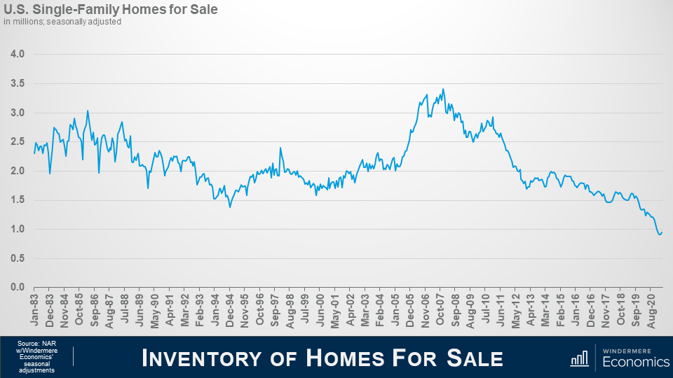
And this is a problem because the biggest issue the market faces today is that demand for homes is far exceeding supply.
A report I track very carefully — and I am sure that many of you do, too — is the National Association of Realtors pending home sales index, which is shown below.
Although it’s not a perfect indicator, as the survey only covers about 20 percent of all homes that go pending, it does give us a pretty good idea as to what the future may hold given that, all things being equal, about 80 percent of pending homes close within roughly two months, making it a leading indicator.
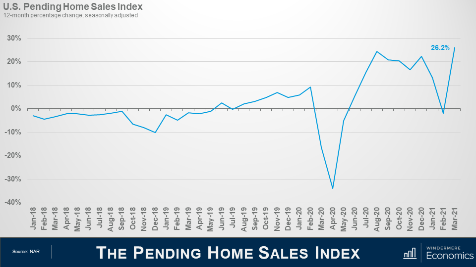
You can clearly see the massive pull back last spring because of the pandemic, but this was very quickly followed by a very significant surge.
It pulled back again last winter, but I would suggest that this was more a function of lack of homes for sale than anything else. However, look at the March spike.
Now, you might be thinking that this is a great number, but I would caution all of you not to pay too much attention to year-over-year changes, as they can be deceiving. You see, the index jumped because it was being compared with last March when the pandemic really started.
Closed sales
When we look at closed sales activity, it actually lines up pretty well with the pending home sales index, which fell in January and February. This is reflected in the contraction in closed sales that we saw this spring. And if the index is accurate, it suggests we may see closed sales activity pick up again over the next couple of months.
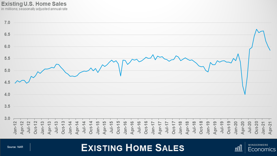
Of course, any time where housing demand exceeds supply, there is a solution — and that would be to build more homes.
But as you can see here, though more homes started to be built as we emerged from the financial crisis, the number today is essentially the same as it was two decades ago and has been declining for the past two years.
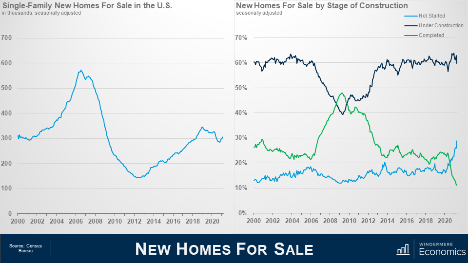
That’s significant, as the country has added over 12 million new households during the same period which has further fueled demand for housing. If there are no new homes to buy, well, that does one thing — and that’s to put more focus on the resale market, which has already led to very significant price increases.
New home market
But this particular report also offers some additional data sets, which I think give more clarity to the state of the new home market.
Before the housing market crashed, you can see that a majority of new homes that were on the market for sale were being built at that time, but — as the housing bubble was bursting — the market dropped, and the share of homes that were finished and for sale naturally rose.
But what I want you to look at is the far right of the chart above. You see the spike in the share of homes for sale that have not yet been started?
Well, given the massive increase in construction costs builders have, understandably, become far more cautious and are trying to sell more homes before they start to build them to mitigate some of the risk. It also tells me that they see demand that is not being met by the existing-home market and are looking to take it advantage of this.
When we look at new home sales, you can see that the trend, in essence, follows the number of homes for sale, but I would caution you on a couple of things.
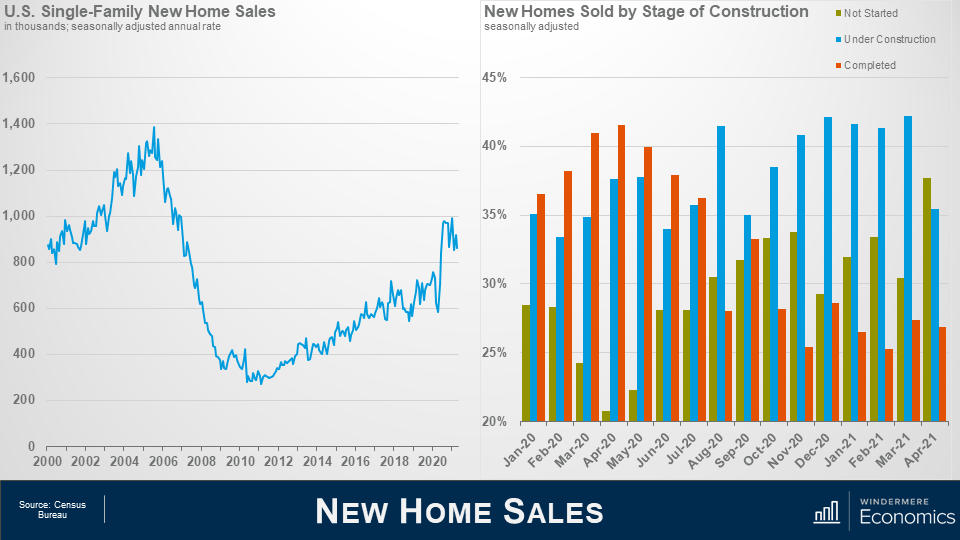
Firstly, these figures do not represent closed sales, as the Census Bureau, which prepares this dataset, considers a home sold once it has gone under contract. This makes sense, as a home can be sold before it has even broken ground. In essence, it’s more similar to NAR’s Pending Home Sales Index than anything else.
Look now at sales by stage of construction on the right. You can see that, as the pandemic was getting started, new homes that were ready to move into were what buyers wanted, and that accounted for over 42 percent of total new sales in April.
As the supply of finished homes dropped, homes that were being built took the lion’s share of sales — as they have done historically. However, look at April. The greatest share of sales — 37.7 percent — were homes that hadn’t yet been started.
Again, this supports the theory that builders remain cautious given ever-escalating costs, but it also shows that buyers’ needs are not being met by the resale market, so they were willing to wait, likely a considerable time, for their new home to be built.
Of course, the couple of datasets I’ve shared with you today are just the tip of the iceberg when it comes to the housing-related numbers you should all be tracking, as they can tell a story that can impact everyone involved in the development or sale of homes.
Mortgage rates
In addition to the data we have discussed today, you should be well versed in mortgage rate trends, demographic shifts, building permit activity and the economy in general — and you need to understand all these numbers at a local as well as national level.
For the vast majority of households, buying a home will be the most expensive thing that they will ever purchase in their lives. And given memories of the housing crash, as well as the significant increase in home prices that we’ve seen since last summer, it’s now more important than ever for you to be able to share your knowledge with your clients and be able to advise them accordingly.
Windermere’s Chief Economist, Matthew Gardner, often contributes to local and national publications with his insights to the housing market. Recently he offered his analysis of home sales numbers to Inman News, this is a repost of that video and article.
 Facebook
 X
X
 Pinterest
 Copy Link
